


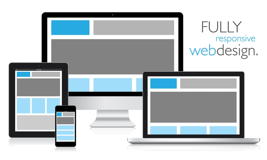
Responsive Web Design
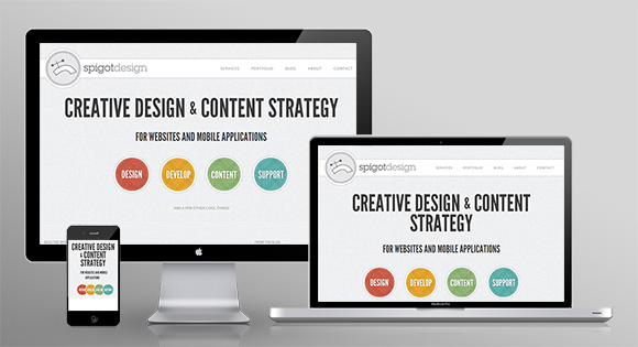
Traditionally, website design was simple. This is because it was meant to run on just one platform; the computer. However innovation has complicated this process due to the number of devices available in the market. Nowadays there is need to couture it that will be supported effortlessly by the range of devices. This is where this technique comes in. This technique aims at producing it which can adapt to all the devices that are used to access the internet. Currently the internet browsing has become a necessity rather than just a leisure activity. More people are using the internet for shopping, reading news and even conducting business. This increase in use of the internet has led to an increase in gadgets that can access the internet.
Lately there has been a massive move from the normal size laptop to the tablet computers. This calls for tablet compatible sites. Also more people are using smart phones to access the internet. Therefore any site that is styled should be able to adapt across this devices. This style uses a technique known as media query to detect the size of the screen and resolutions being used by the client. Once that has been detected then the site re-sizes automatically to fit into the screen without distorting the content or the accessories such as the scroll bars.
This kind of couture has become a necessity because of the changing needs of internet information consumers. The major advantage of this technique is cost reduction. This is due to the fact that an organization of business is able to construct one site that will effortlessly on all devices regardless of their screen sizes.
This is unlike the traditional site layout, where people who wanted to communicate information over the internet were required to have two sites:
One a standard website for the PC A mobile compatible website.
This is because information on the PC website gets distorted when accessed using a mobile device due to the difference in screen size. This layout overcomes this hurdle and cut down the cost while at the same time offers quality information to users regardless of their platforms.
This oultok has a positive effect on the search engine optimization. Traditionally, the mobile site was contained in a sub domain and all links in it had to be rerouted to access the content. This is not the case while using this technique; all it does is to re-size the main one to adapt to different screens. This technique does not affect the ranking of the sites in the search engine unlike its predecessor.
This technique also comes in handy in aiding the process of leaning the art of site outlining. Traditionally, this has been a daunting task since the sites were rigid. However, the tutorials accompanied by this flexibility make learning site style much easier.
This outlook is the future of network enhancement. The benefit that comes with it makes it a top consideration while developing a corporate or even individual site. This is a concept in which it is coutured in such a way that it is best viewable in all the devices including mobile phones, laptops, smartphones, tablet PCs and desktops of different sizes and models. All these devices have different size of monitor or screen and various viewing environment conditions. So, there are chances that it looks attractive and properly styled in a PC or laptop may not look justified on a Tablet PC. The purpose of getting a flexible one atyled is to make it properly viewable in any browser. This is convenient to scroll and view in different browsers in various devices. It furthermore helps in representing your site to people habitual of browsing internet on even Tablet PCs, Cell Phones etc.
In this, the pages are coded utilizing the cascading sheets containing special coding which can identify the size and style of the screen in which it is being surfed and then its content are modified according to the exact size of the monitor of the device.
Why is it Essential to Have a Responsive Web Design?
Nowadays, companies target the clients which are using numerous platforms employed on various devices by getting their site converted into this flexible couture. To be successful in business, it has become important to remain up-to-date with the current information technology. Thus, to capture the attention of those clients also who are using Tablet PCs, cell phones etc. to browse the internet becomes essential. For example if any visitor is searching for the product you provide, but is not able to view it properly on the specific model of cell phone using a different browser, then you may lose a customer which can be not at all profitable for your business. So, it becomes vital to avail flexible outlook services and getting it converted into a website which can be viewable by many people so that you are able to target those people also who find the use of mobile phone very much convenient and cost effective for browsing internet nowadays. To convert it into a flexible one, you need to invest in flexible one provided by many site courturing companies in India.
Moreover, a responsive site is SEO friendly and can easily achieve high rank in search engines easily because that solves the purpose of multiple website and is using latest styling tools and techniques. Thus, each and every business man should invest in this services and get a mobile compatible site styled for their companies.
Advantages of Responsive Website Design
- Using this for your business site would enable you to save a great deal of money because getting different sites for different browsers and devices can be obviously expensive.
- The companies need to spend updating and maintenance costs on different sites. This is not the case with it as you need to maintain and update only one solving various purposes.
- The use of mobile phones, laptops, tablet PCs etc., has become quite common nowadays. Many people use it for even searching products, services or business. If it is not compatible with different browsers and devices, then you may fail to get attention of many of your potential clients.
- Its redesign can improve the navigation experience of the users as the pages fit perfectly on any screen for right viewing and also can be scrolled without any problems.
- Through this, you will be able to serve your customers in a better manner because considering the latest trends, the cell phones, tablets, ipads etc., are being utilized for many business functions.
- If you are having this kind of site for your company then your get more visitors on your site and improve its popularity.
Why to Convert an Existing Website into a Responsive Web Design?
Converting an existing site into a responsive one can of course justify the amount of investment because it actually happens to be preferable by many people browsing the internet using mobile phones, Tablet PCs, iPads etc. Thus, each and every business site should be converted into flexible one and get more compatible with latest browsers and devices.
Conversion of the present one into a responsive one may assist in avoiding initial costs necessary to build a responsive one from scratch. You also never would like to disturb your business by showcasing an entirely new one to your clients. You would never like to lose your clients because of your site not functioning properly. Thus, it would be advisable to get your present website into flexible one.
Hire an Expert Web Design Company for Responsive Website Designing Services
It is a known fact that people are going to surf the internet on mobile more than a desktop or a PC in the future which means that most of the buying and selling, business activities, social communication, marketing etc., would be done through a mobile phone. This is the reason why businesses and people are looking for getting a mobile compatible one designed which is best viewable in all the latest browsers and devices of different screen resolutions. If you are planning to get this kind of site designed or your present site converted into flexible one, then you need to hire an experienced site couture company having complete knowledge of how to couture the latter one. The couturiers working in the company should be aware of all the modern techniques used to design this. After all, your business site is the most important element required for the growth of your business and you cannot risk it by handling the job to a site couture company which is not reliable. You need to go through the below tips which would help you in selecting the right site couture company for couturing your responsive one.
- Make sure that the company you hire considers the type of business and its requirements relating to a responsive one and then plan how to fulfil them.
- The company should be aware of all the latest design rules related to responsive one and mobile compatible one techniques.
- The company you hire should ensure that your responsive website designed should fit on various screen resolutions while the users are navigating it. Whether the user is using windows, Linux, Android, Blackberry, or any other desktop and mobile based applications, your website should best suit any environment.
- The company should be having all the tools and skills required to fit your website to small and large screen resolutions which are commonly used by people. They should be updated with latest flexible restructuring techniques and mobile compatible web design tactics.
- Last but not the least, just hire right professionals who can complete the job within a committed time frame.