


In the dynamic realm of e-commerce, the triumph of your WooCommerce website extends beyond the products you provide. Equally vital is your ability to captivate and engage visitors, fostering heightened conversions and satisfied customers. This underscores the significance of optimizing the user experience (UX). In this comprehensive guide, we will explore the best practices for WooCommerce website design that not only ranks high in search engines but also provides a seamless, delightful shopping experience for your users.
Understanding the Significance of UX in WooCommerce
Before delving into the specifics of optimizing the user experience, it’s crucial to comprehend the significance of WooCommerce website. The reasons are multifaceted:
- Elevated Customer Satisfaction: A favorable user experience creates a lasting impact on your customers, increasing the likelihood of their return for repeat purchases.
- Increased Conversions: A meticulously optimized website has the potential to substantially enhance your conversion rates, leading to heightened revenue.
- Lower Bounce Rates: When users find your website easy to navigate, they are less likely to bounce away, reducing your bounce rate.
- Better SEO Rankings: Search engines like Google favor websites with excellent user experiences, which can help you climb up the search result rankings.
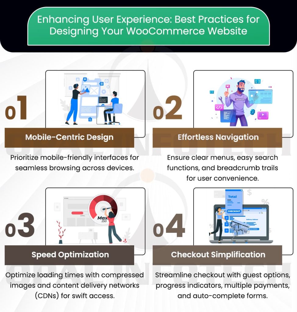
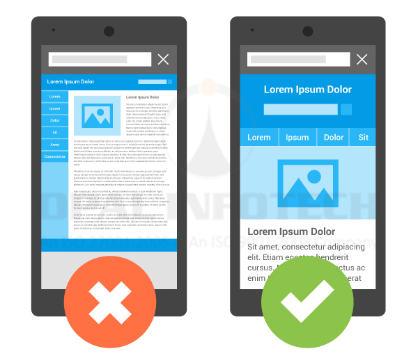
Designing for Mobile Responsiveness
The digital age has witnessed a significant shift towards mobile browsing and shopping. Therefore, it is crucial to ensure that your WooCommerce website is responsive to various devices. This involves:
- Mobile-First Approach: Commence your design process by prioritizing mobile devices and subsequently adapt it for larger screens.
- Fast Loading Times: Optimize your website for swift loading on mobile devices, recognizing that users tend to be notably impatient.
- Touch-Friendly Design: Buttons and links should be large enough to be easily tapped on touchscreen devices.
- Fluid Design: Your website should adjust seamlessly to different screen sizes and orientations.
Streamlining Navigation
An intuitive and well-structured navigation system forms the backbone of a stellar user experience, and this can be achieved through:
- Clear Menu Structure: Simplify your menu categories, ensuring they are straightforward and user-friendly for easy navigation.
- Search Functionality: Integrate a robust search feature that includes filters and sorting options to enhance user convenience.
- Breadcrumb Trails: Use breadcrumb trails to help users understand their current location within your website.
- Internal Linking: Thoughtfully link related products and content to augment user engagement.
Prioritizing Page Speed
Website loading speed is crucial not only for mobile users but for all visitors to your site. Sluggish loading times can result in user frustration and elevated bounce rates. To ensure a swift experience:
- Image Optimization: Compress and optimize images to reduce their file size while maintaining quality.
- Caching: Integrate caching mechanisms to store frequently accessed data, thereby diminishing the necessity to retrieve it from the server repeatedly.
- Content Delivery Networks (CDNs): Employ CDNs to distribute content geographically, thereby minimizing latency and enhancing overall website performance.
- Minimize HTTP Requests: Diminish the number of requests required to load a page by consolidating CSS and JavaScript files.
Aesthetically Pleasing Design
Visual appeal is a significant factor in user experience. Aesthetically pleasing web design elements can help engage visitors and leave a positive impression:
- Consistent Branding: Uphold a consistent brand identity through the use of uniform colors, fonts, and imagery.
- High-Quality Imagery: Incorporate high-resolution product images and contemplate implementing 360-degree views or videos for a more immersive user experience.
- Whitespace: Allow for ample whitespace to prevent a cluttered, overwhelming look.
- Typography: Opt for legible fonts, taking into consideration their readability across various screens.

Optimizing Checkout Process
The checkout process is the pivotal point where users make the decision to either complete a purchase or abandon their carts. To streamline this crucial phase:
- Guest Checkout: Offer a guest checkout option to avoid compelling users to create an account.
- Progress Indicators: Clearly display the steps of the checkout process to reassure users and provide transparency.
- Multiple Payment Options: Furnish various payment methods to accommodate diverse preferences and enhance user convenience.
- Auto-Complete Forms: Use auto-complete features to speed up the data entry process.
SEO and User Experience
A great user experience also contributes to your SEO strategies. Search engines reward user-friendly websites, so:
- Quality Content: Deliver informative and well-structured content that adds significant value to users.
- Mobile Friendliness: Prioritize mobile-friendliness, as Google gives preference to websites that are optimized for mobile devices in its rankings.
- Low Bounce Rates: A high-quality user experience often results in lower bounce rates, a metric favored by search engines.
- Social Sharing: Actively encourage social sharing, as it can amplify your website’s visibility and reach.
Conclusion
Optimizing user experience goes beyond being a trendy catchphrase; it is a fundamental aspect of running a successful WooCommerce website. By adhering to the best practices outlined in this article, you can develop a website that not only ranks well in search engines but also fosters customer loyalty. In the realm of e-commerce, a superb user experience can be the decisive factor for sustained success.