


Mobile devices have become the primary means of accessing the internet.
In recent years, with the increasing use of mobile devices for browsing the internet, designing websites with Mobile-First Design has become more important than ever before in Australia. Mobile-First Design is an approach to web design where the design process starts with the mobile experience in mind, rather than focusing on the desktop experience first. This approach means that designers prioritize the content and features that are most important for mobile users, and then adapt the design for larger screens.
As a result, developing websites with a mobile-first approach has become increasingly important. A mobile-first approach means designing websites with the mobile user in mind first and foremost and then adapting the design for larger screens such as desktop computers.
By designing with Mobile-First Design principles in mind, you can create websites that are optimized for the mobile user and provide a better overall user experience.
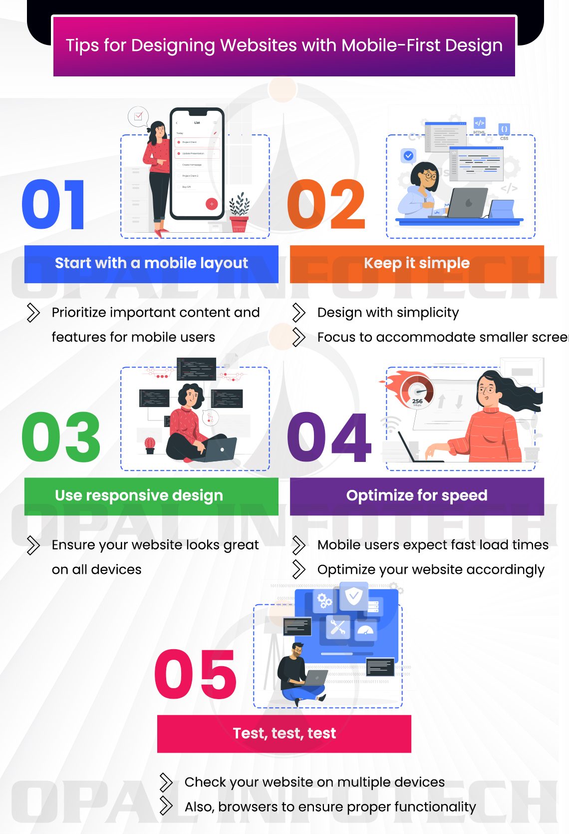
Mobile-First Design is a design philosophy that prioritizes the mobile experience over the desktop experience when designing websites. With the majority of internet users accessing websites on their mobile devices, it’s become increasingly important to design with mobile in mind. Here are some tips for designing websites with Mobile-First Design:
- Start with a mobile layout: Begin by designing the mobile version of the website first. This will help you prioritize the most important content and features for the mobile user.
- Keep it simple: Mobile screens are smaller, so keep your design simple and focused. Avoid clutter and unnecessary elements that may slow down load times.
- Use responsive design: Responsive web design ensures that your website looks great on all devices, including desktops, tablets, and mobile phones. This means designing with flexible layouts and using media queries to adjust the layout based on screen size.
- Optimize for speed: Mobile users expect fast load times, so optimize your website for speed. This includes reducing image sizes, minimizing code, and using caching tools.
- Test, test, test: Make sure to test your website on multiple devices and browsers to ensure that it looks and functions properly on all platforms.
Mobile-first design forces website designers to prioritize information since you don’t have much space, so you need to pick and choose only the most important content to include on the mobile screens. One of the main benefits of a mobile-first approach is that it ensures that websites are optimized for smaller screens and slower connections. This is particularly important in Australia, where users access the internet via mobile networks with diverse levels of coverage and speed. A mobile-first approach can also improve website load times, which can significantly impact user experience and search engine rankings.
To design websites with a mobile-first approach, designers should focus on creating clean, simple designs that are easy to navigate on small screens. This may involve using larger fonts, simpler layouts, and fewer images and videos. Designers should also prioritize important content and functionality, such as contact information and call to action, to ensure that they are easily accessible on mobile devices.
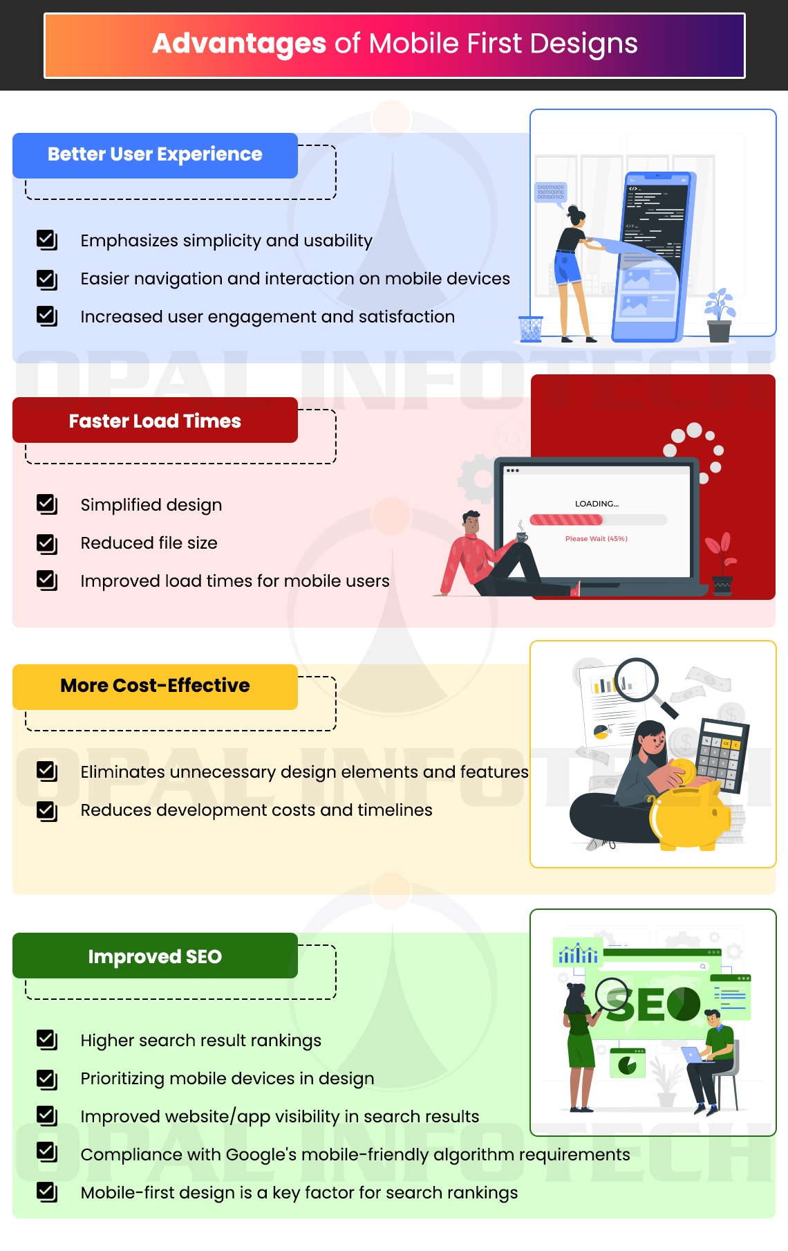
Advantages of Mobile First Designs:
Mobile-first design is a design approach that prioritizes designing for mobile devices before designing for desktops or other larger screens. There are several advantages to this approach, including:
- Better User Experience: Mobile-first design places a strong emphasis on simplicity and usability, making it easier for users to navigate and interact with your website or app on their mobile devices. This can result in higher user engagement and satisfaction.
- Faster Load Times: Mobile-first design often involves simplifying the design and reducing the file size of your website or app, which can help to improve load times. This is important because mobile users tend to have less patience for slow-loading websites or apps.
- More Cost-Effective: Designing for mobile first can be more cost-effective than designing for desktops or larger screens. By focusing on mobile devices first, you can eliminate unnecessary design elements and features, reducing development costs and timelines.
- Improved SEO: Google has affirmed that mobile-first design is a key factor for search rankings. By prioritizing mobile devices in your design, you can improve your website or app’s SEO and increase visibility in search results. Google has affirmed that it prefers mobile-friendly websites and websites that are not optimized for mobile devices may be penalized in search rankings. By starting with a mobile-first approach, designers can ensure that their website meets Google’s mobile-friendly algorithm requirements and is more likely to rank highly in search results.
Overall, we at Opal Infotech with a mobile-first design approach can provide many benefits for businesses and organizations by focusing on simplicity, usability, and speed, businesses can improve their users’ experience and ultimately achieve their goals more effectively.